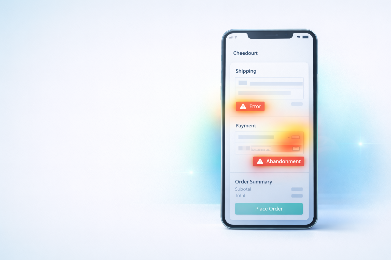
Mobile Checkout Revenue Leaks: How Small UX Issues Quietly Kill Conversions
Mobile Checkout Revenue Leaks: How Small UX Issues Quietly Kill Conversions
Mobile traffic now dominates ecommerce.
For many stores, more than 60–80% of visitors arrive from mobile devices — yet desktop conversion rates still outperform mobile by a wide margin.
The reason usually isn’t pricing, products, or demand.
It’s friction.
Small usability issues that barely register during testing can completely break real purchasing behavior on phones.
Mobile checkout failures rarely appear as obvious errors. Instead, they show up as hesitation, repeated taps, and silent exits.
This guide explains how to identify the most common mobile revenue leaks — and how to find them using real behavioral data.
Why Mobile Checkout Fails Differently
Desktop users tolerate minor inconvenience.
Mobile users don’t.
On a phone:
- attention is shorter
- typing is harder
- visibility is limited
- patience drops quickly
Every extra action increases abandonment risk.
The 7 Most Common Mobile Checkout Revenue Leaks
1. Hidden Continue Buttons
A frequent issue:
The “Continue” or “Place Order” button sits just below the visible screen area.
Users:
- scroll slightly
- stop
- assume checkout is broken
- leave
Session replays often show users pausing with no interaction before exiting.
2. Keyboard Obstruction
Mobile keyboards can cover critical elements:
- next fields
- error messages
- submit buttons
If users cannot see feedback, they assume nothing worked.
Watch for repeated taps followed by exits.
3. Wrong Keyboard Types
Small detail, big impact.
Examples:
- Email field shows numeric keypad
- ZIP code shows full keyboard
- Phone number allows letters
Each mismatch slows completion and increases mistakes.
4. Tap Targets Too Small
Buttons designed for desktop often fail mobile usability.
Signs include:
- multiple missed taps
- rage clicking patterns
- repeated zooming gestures
Users shouldn’t need precision to buy.
5. Surprise Layout Shifts
When totals update or sections expand:
- page jumps
- focus changes
- buttons move
Mobile users lose orientation instantly.
Unexpected movement breaks trust.
6. Excessive Form Fields
Typing on mobile is expensive effort.
Common offenders:
- unnecessary address lines
- repeated information requests
- optional fields presented as required
Every additional field increases abandonment probability.
7. Slow Feedback After Actions
Even a one-second delay without visual feedback feels broken on mobile.
Users expect:
- loading indicators
- button state changes
- confirmation messages
Without feedback, users tap repeatedly or exit.
(If you notice repeated taps, see our rage-click analysis guide.)
👉 Link to Rage Clicks post.
How to Diagnose Mobile Problems Quickly
Instead of guessing, follow this workflow:
- Filter sessions by mobile device.
- Focus on users reaching checkout.
- Watch exits occurring within checkout steps.
- Look for hesitation, repeated taps, or scrolling loops.
- Identify patterns across multiple sessions.
You’ll often discover the same issue appearing again and again.
If you’re unsure where abandonment begins, start with identifying your highest drop-off step.
👉 Link to Checkout Drop-Off guide.
Small Fixes, Large Results
Many mobile conversion improvements come from small adjustments:
- Increasing button size
- Changing keyboard input type
- Adding loading indicators
- Simplifying forms
- Repositioning CTAs
These changes rarely require full redesigns — just clarity.
Why Mobile Optimization Is Continuous
Devices change. Screen sizes evolve. Browsers update.
What worked six months ago may now introduce friction.
Behavior analytics gives ongoing visibility into how real customers experience your checkout today — not how it worked during testing.
Final Thought
Mobile checkout problems don’t announce themselves.
They appear as silent exits and lost revenue.
When you watch real behavior instead of relying only on metrics, the causes become obvious — and fixes become measurable.
Run Spyglass360 on your store and discover how mobile users actually experience your checkout flow.